Data Analysis
Research Visualization Pack
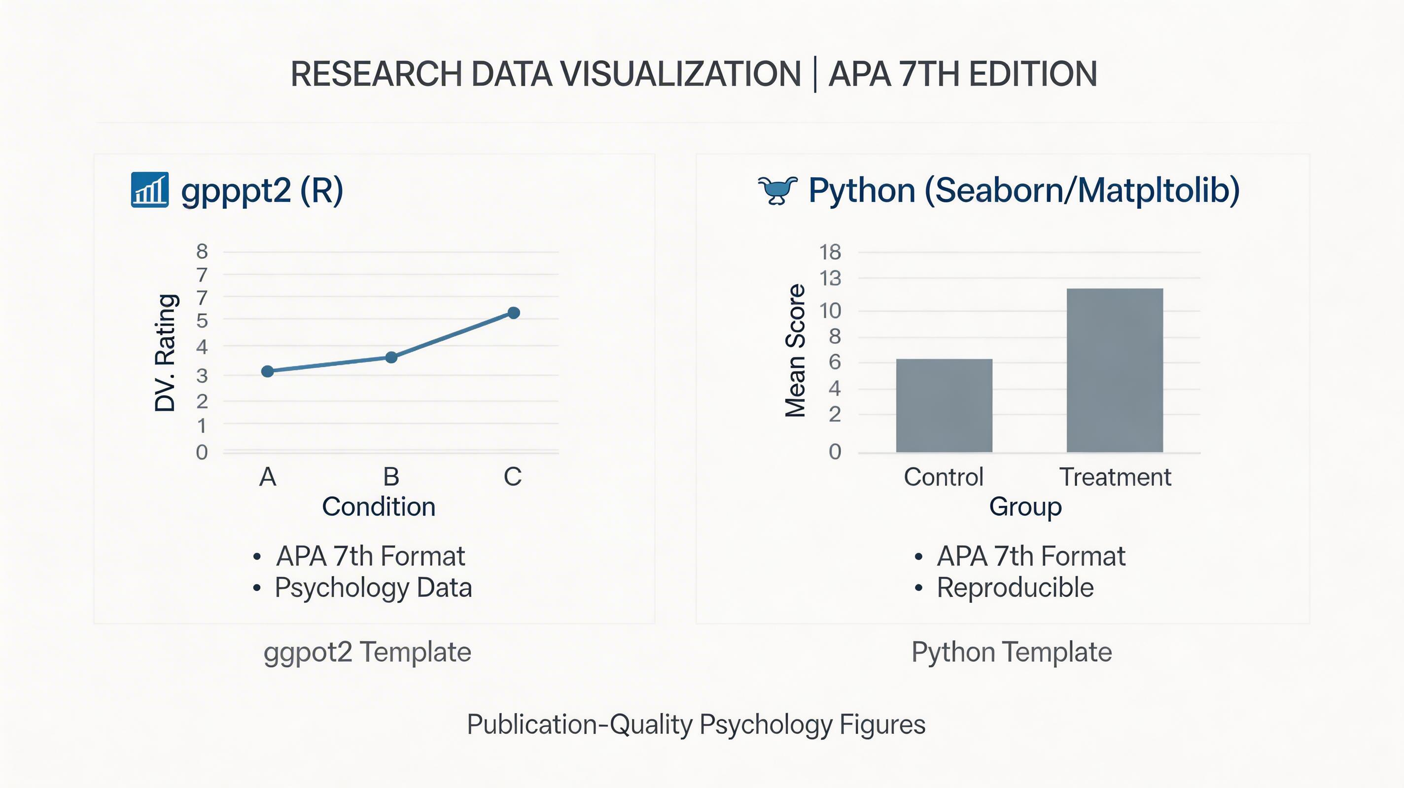
Publication-quality figures for psychology data — ggplot2 and Python templates
¥19.99
412 researchers installed this
5.0(1)
About this skill
What it does
Generates code for publication-ready visualizations in both R (ggplot2) and Python (matplotlib/seaborn), with APA-style defaults baked in.
Chart types included
Group comparisons
- Raincloud plots (raw data + violin + boxplot)
- Bar charts with error bars (SD, SE, 95% CI)
- Interaction plots for factorial designs
Correlations
- Scatter plots with regression lines and CIs
- Correlation matrices (corrplot / seaborn heatmap)
- Partial correlation networks
Longitudinal data
- Spaghetti plots (individual trajectories)
- Growth curve visualization
- Change score plots
Clinical / applied
- ROC curves
- Bland-Altman plots
- Survival/Kaplan-Meier curves
Style
All outputs default to APA 7 figure standards: white background, no gridlines, accessible color palette, 300 DPI export.
How to use
Describe your data structure and the story you want to tell. Receive annotated, runnable code.
What researchers say
5.0(1)
周明北师大心理学博士三年级 · BNU Psychology PhD Y3
用Python生成了论文里所有的APA格式图表——回归散点图、交互效应图、路径图。导师说是我们组发表论文里视觉效果最好的,编辑也没有提任何图表修改意见。
¥19.99
412 researchers installed this
Secure checkout via Alipay
About the Creator
ResearchAI Lab
@research_ai
Building AI workflows for academic researchers since 2023.
Details
- Category
- Data Analysis
- Installs
- 412
- Published
- Feb 25, 2026